Sunday 17 August 2014


Research and concepts - Land meeting sea pt 2

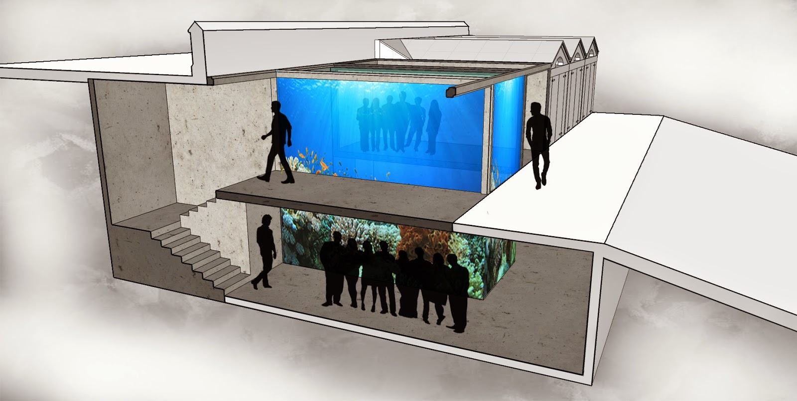
Based off my last design I decided to develop a new way in which the idea of Land meeting sea could be materialized. Some of my concepts included a floating boatshed placed in the middle of the harbor, a wave generator placed inside of a boatshed and a modular pod that would move around with the tides. But the concept that I thought topped the rest was the idea of an aquarium in the boatsheds. Taking what was in the sea and placing it on land felt like a good portrayal of the idea land meeting sea.
 |
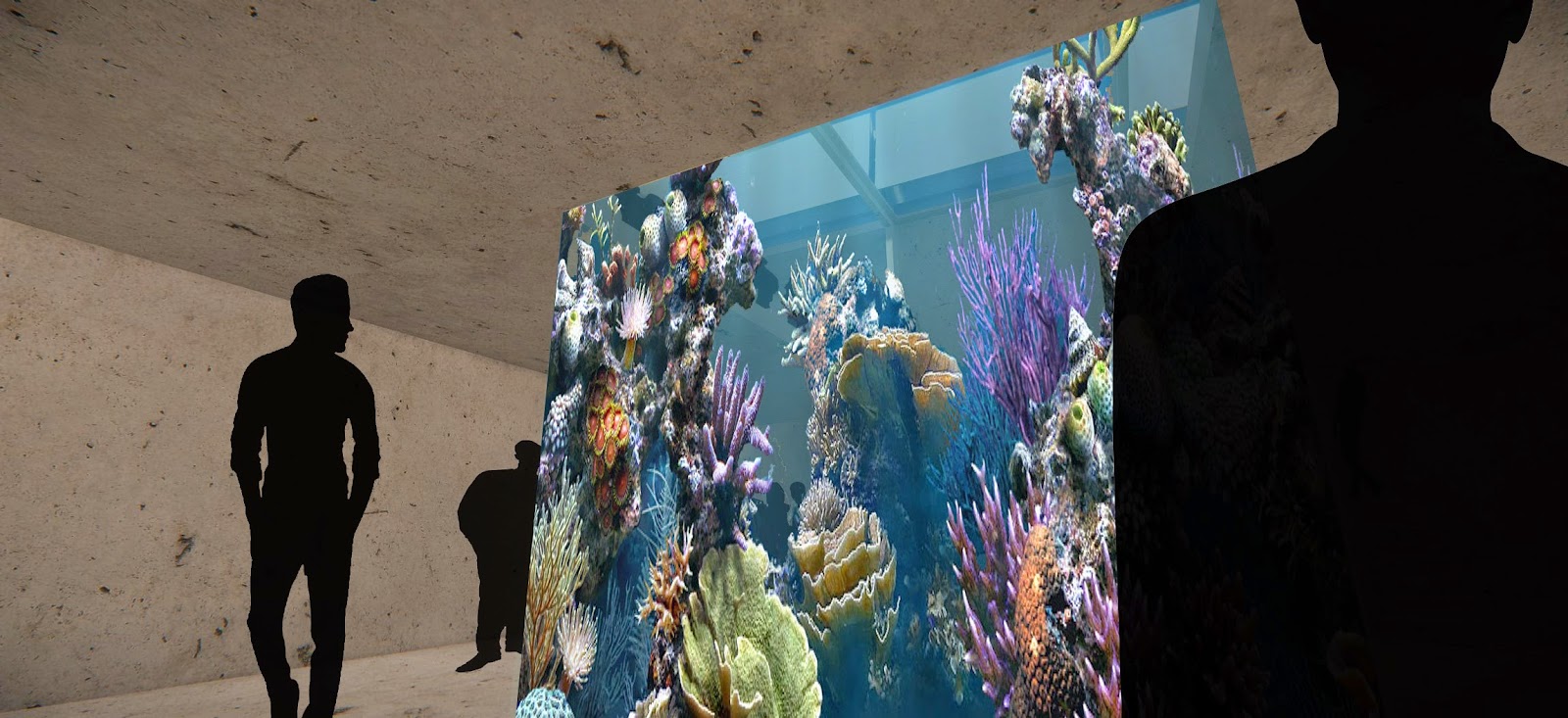
These concepts show how the aquarium would fit between two boatsheds. My idea was to have a two story tank that could be viewed from both sides, the stairs at the back of the sheds allows you to walk around both sides of the tank on both of the levels. The space between the stairs would be used for the pumps and filtration systems required for a tank of this scale. I decided to use a tropical tank in this design to provide the user with an experience that they couldn't get looking at local sea life.
|
Saturday 9 August 2014


Concepts - Land meeting sea

An area constantly being changed by the elements factoring in weather and tidal patterns. Beaches have ever changing landscapes and it is this ideal that I want to incorporate into my design. I first looked into how movement is currently being used in architecture and found my idea for my first concept, the modular "Pods".

The idea behind this design was to have two separate Pods that the public would be able to arrange in anyway they wanted. They could be furnished with lounging furniture, used as a public bathroom or a gallery space. It was after the idea of having the idea of a gallery that I then came up with my final concept, as a gallery in itself also has this element of constantly changing and moving.


This design has a large empty frame with wooden panels on the roof and front wall that can be moved/adjusted either manually or set to move automatically with the weather, time of day or tide. The four walls placed in the middle of the structure are not permanent to allow of a range of gallery types and installations. The effect of these movable panels is more visible in my perspective drawings.
Monday 4 August 2014
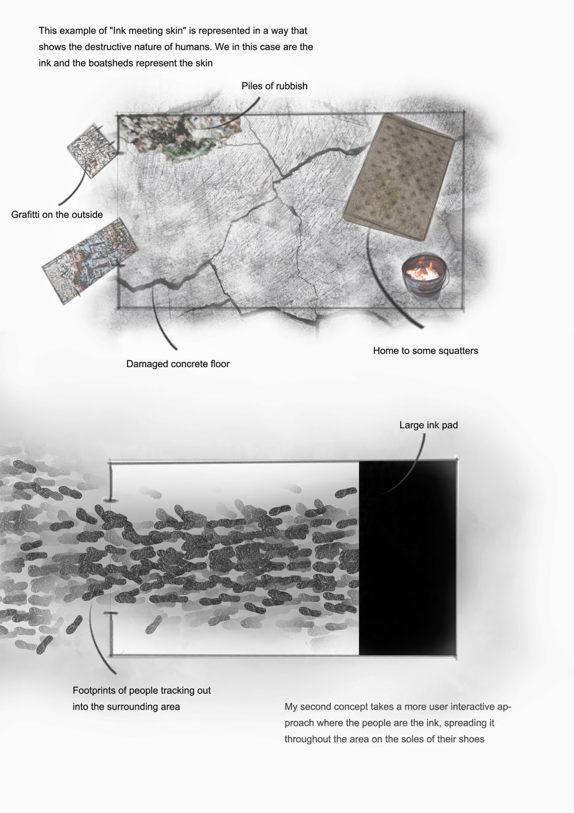
Material - Ink meeting skin
 |
| Starting with a plain piece of styrofoam I carved out the impression the public would leave when using the space. |
 |
| The paint shows how the layers look when worn throughout the room. |
Sunday 3 August 2014
Friday 1 August 2014


Wednesday 30 July 2014


Saturday 26 July 2014


Research - Ideas meeting reality
After deciding that my first design would be based around the concept of 'Ideas meeting reality' I started to look into different spaces that promote this type of meeting. There are many different examples of Ideas meeting reality whether it be in a mathematical finding of some kind or an interaction between a designer and their selected medium. Computers , classrooms, offices, studios, labs and books are just some examples of things that either promote this theme of ideas meeting reality or objects that make this interaction between two entities possible. From that list of 'mediums' I decided to design an interactive studio space, as apposed to a space that would display ideas that had previously 'met' reality.


These three examples show some similar features like adequate seating, large open desks and computer access to give designers a layered experience when working. One thing that I want to incorporate into my design is simplicity. To strip back all the complicated tools and processes when designing to give the user a more tactile and immersive experience. This is where I came up with the idea of using chalkboards. When designing, having limitations within any medium is frustrating and can often lead to a poor representation of the users original idea. With this in mind I started looking at chalkboards and how they are used today in this technological era.

This first example is taken from a Nissan design studio. The space consists of two large free standing walls lined with chalkboards. Between the two walls sits a medium sized desk with a fair amount of seating, a collaborative space where employees can come together to share and discus design ideas . For a company like Nissan to have such an installment speaks volumes as to how well chalkboards still function today, among their digital counterparts. One reason why I believe they have gone old school and used the more tactile interface is because of its simplicity. There are no training sessions or tutorials needed to be able to use a chalkboard and that Is why it would be the perfect medium for my design space. Other properties that chalkboards have that would benefit my design idea are that it can be wiped clean, my original idea was to have walls lined with paper but the practicality of that compared to using chalkboards didn't add up. Chalkboards are also a great medium because they get you to work on a vertical plane, getting you out of your seat and more mobile when drawing.
Saturday 19 July 2014


Subscribe to:
Posts (Atom)